Branding
Marketing Material
Style Guides
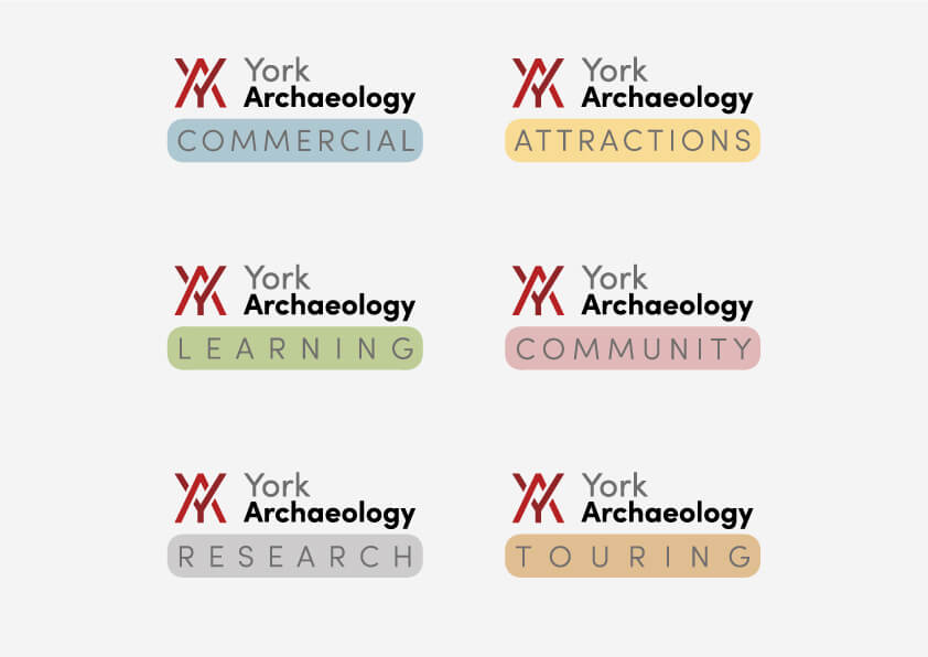
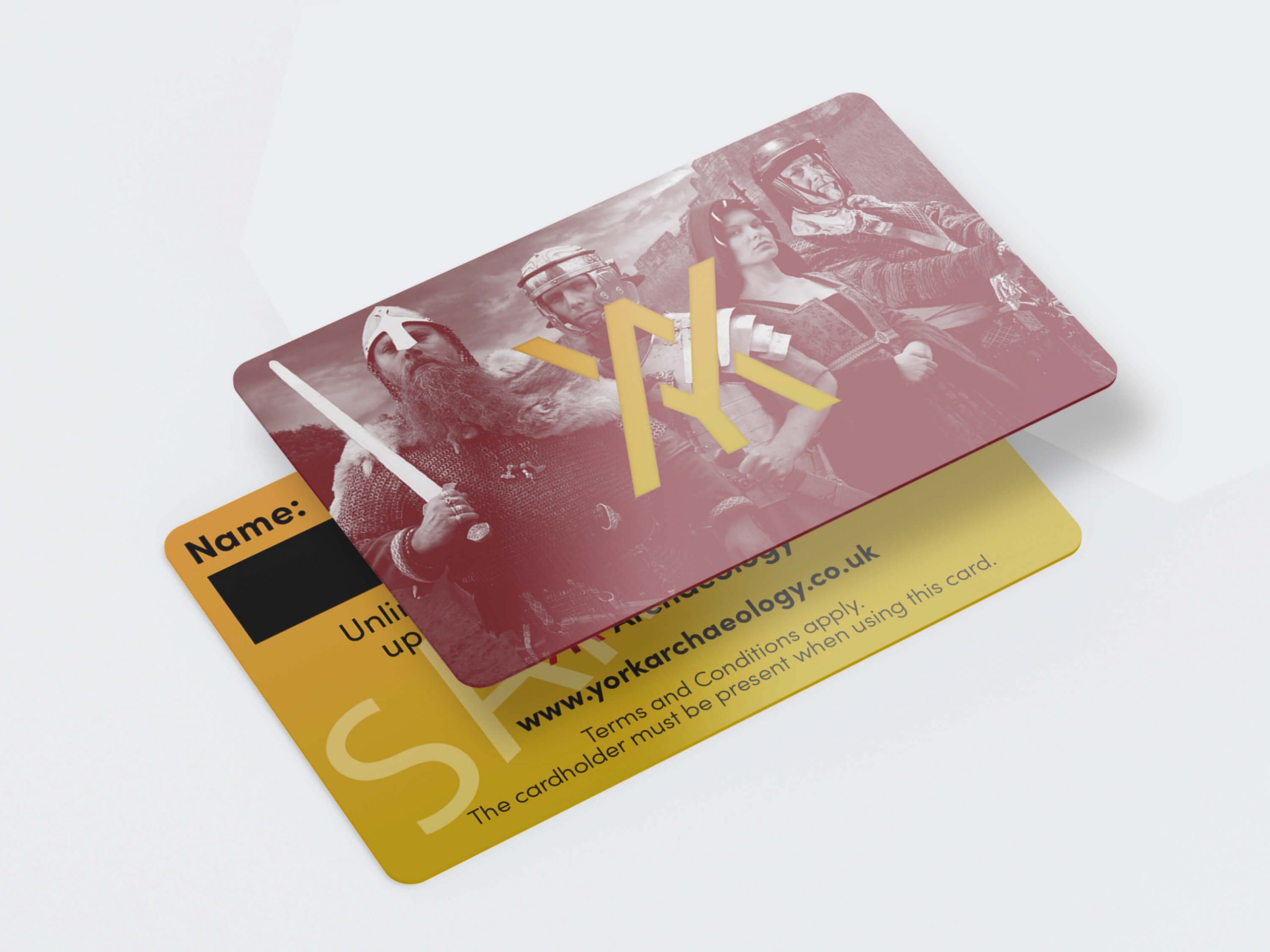
In mid-2023, York Archaeological Trust had a rebrand to York Archaeology. The goal of the rebrand was to bring more public awareness to every aspect of the company, associating the well-known JORVIK Viking Centre with a new brand which included other branches of the business such as Public Outreach, Education, and Commercial Archaeology, bringing them all under one umbrella brand ‘York Archaeology.’
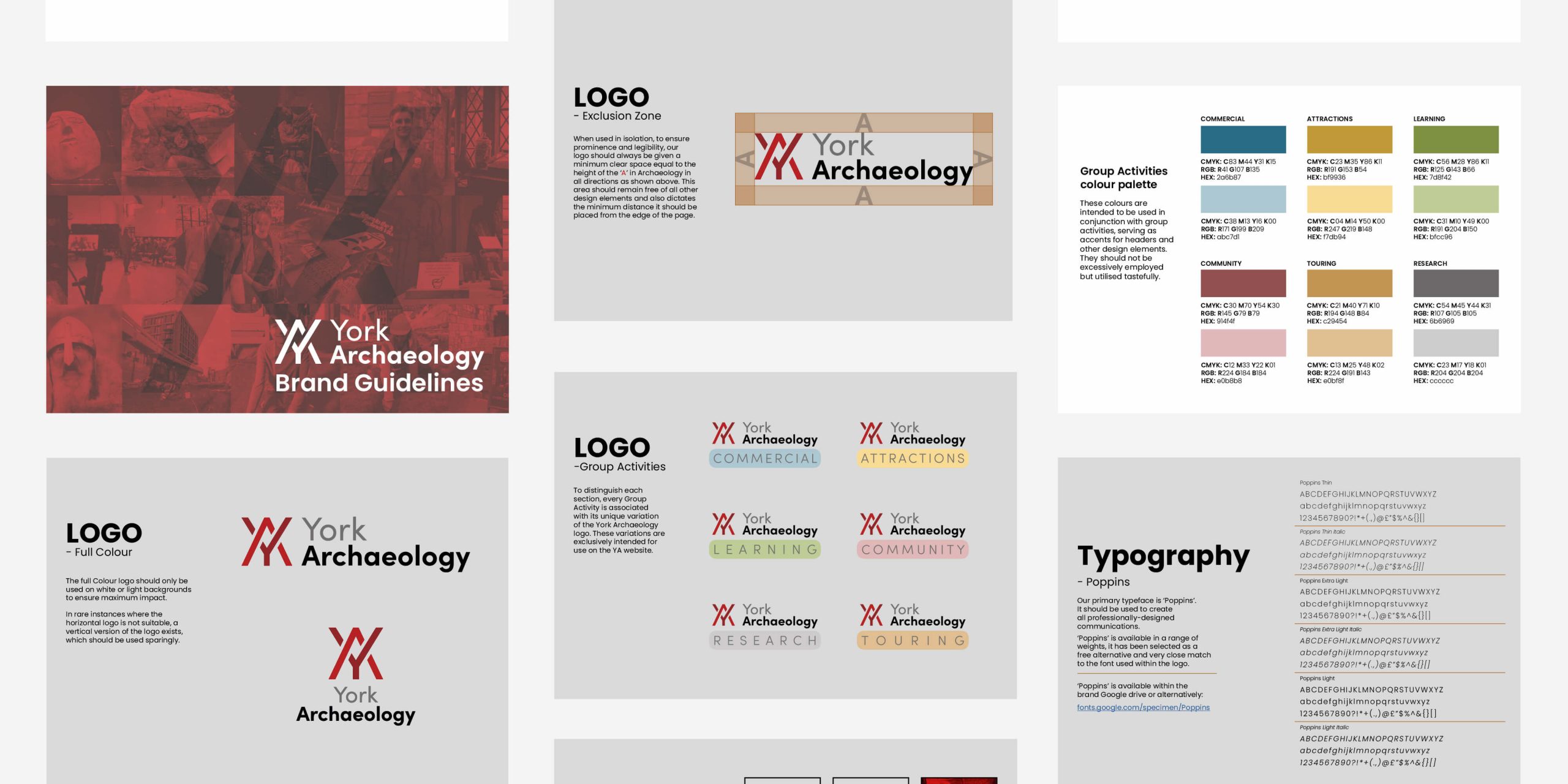
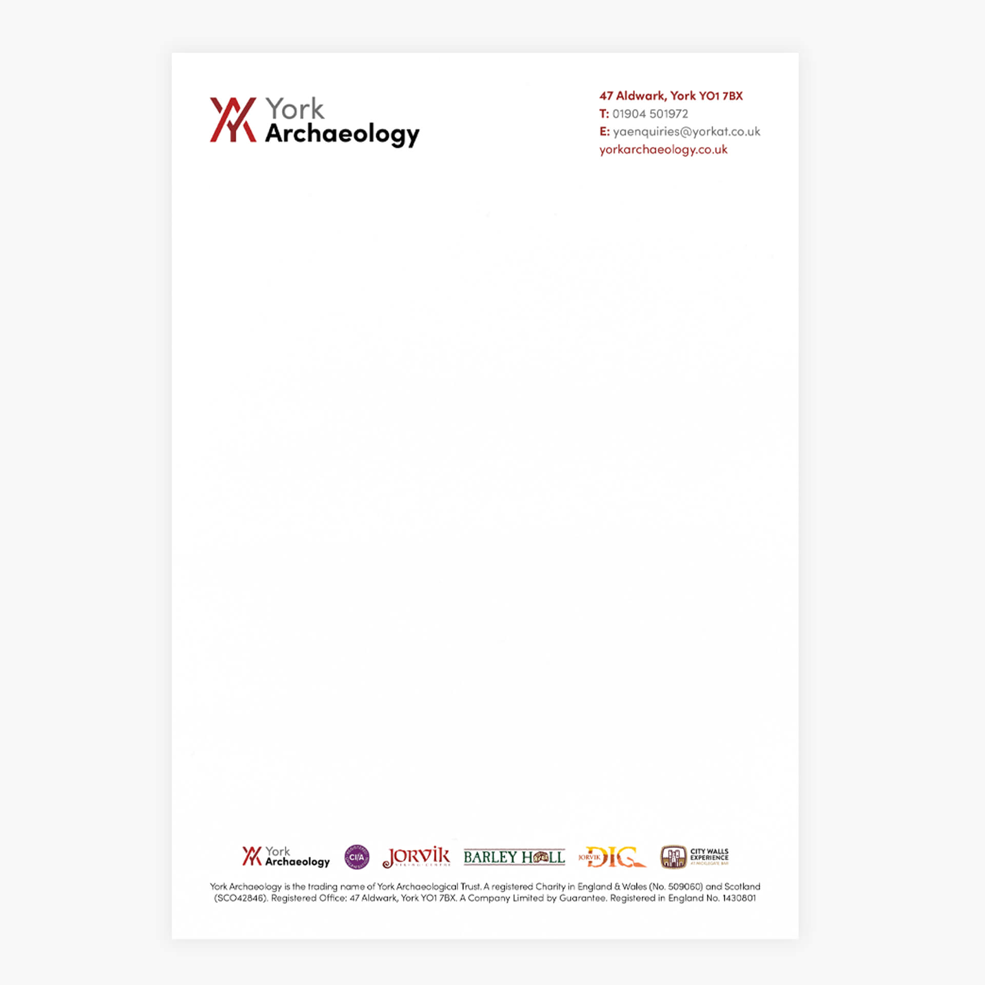
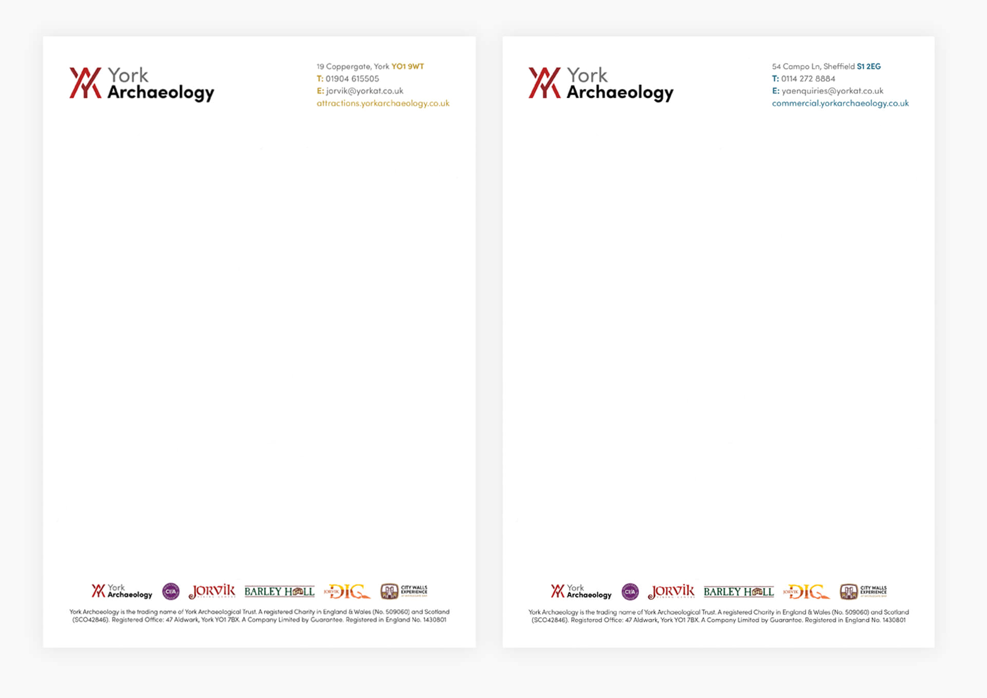
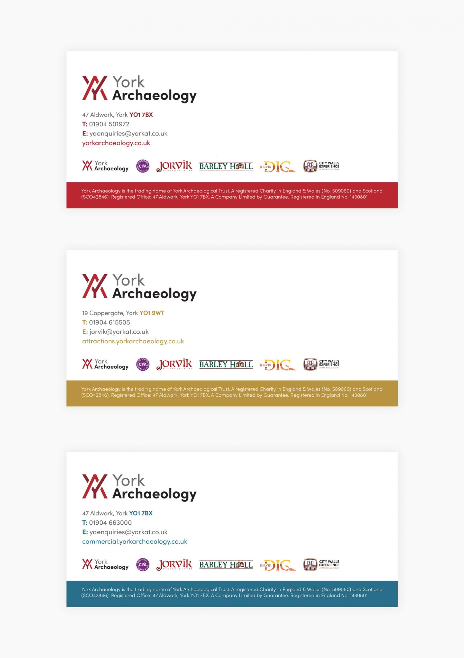
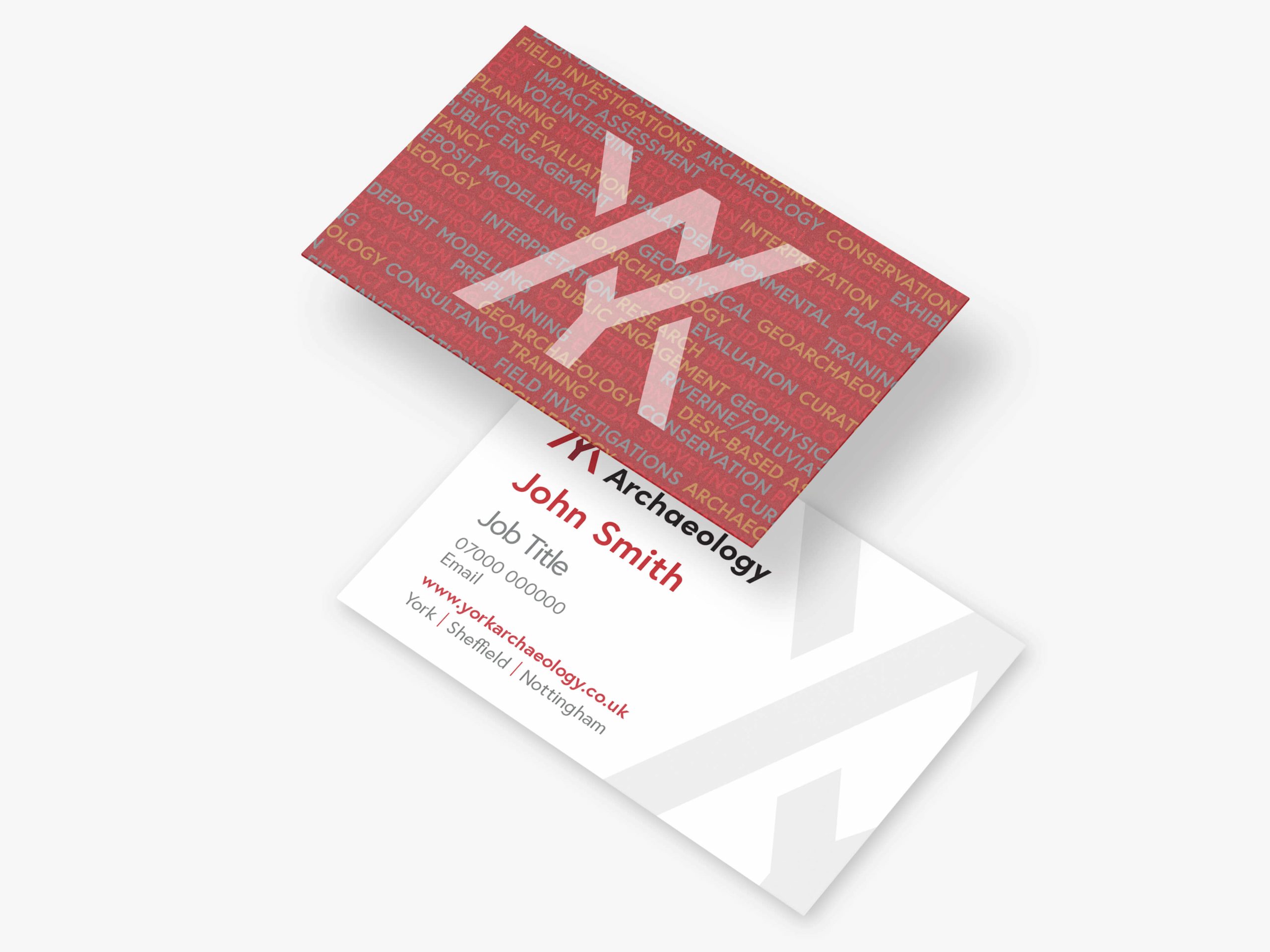
The rebrand involved creating a new visual identity, brand guidelines, company stationary and updating signage and ID cards across all York Archaeology offices nationally.

 George Slater Design
